“Save to Curator”
This week we are launching publicly our OS X Safari extension.
Curator users will be able to send websites’ images and urls from their computer using a simple Safari extension.
Save to Curator from your Computer
There is now a ‘Save to Curator’ extension for Safari which makes it super simple to add images and whole websites to Curator. It’s our first foray outside iOS and we are very excited about it!
Features
– click to select single or multiple images to save
– single click save website to Curator
– fetch automatically hires pictures for you on some common websites
Coming soon
– workflow optimisation based on users’ feedback
– create boards from the extension
– upload images from the Finder
Spring update
We launched Curator for iPhone late last year along with backup and sync, to make sure your content is safe and available on all your devices. Since then we have been busy working on the next major release, but also introduced a number of smaller but nifty additions so check out the latest version
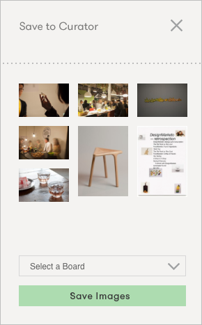
Save to Curator from your Computer
There is now a ‘Save to Curator’ extension for Safari which makes it super simple to add images and whole websites to Curator. It’s our first foray outside iOS and we are very excited about it!
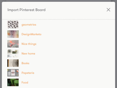
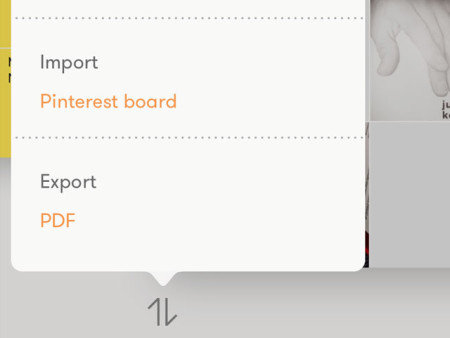
Pinterest Import
You can now bring your Pinterest boards into Curator and enjoy the content in full screen mode. Perfect for presenting your already collected inspiration, references or ideas. Get started in the ‘Import / Export’ menu found bottom left under your boards.
PDF Export
Make any board into a nice-looking PDF for easy printing or emailing. Choose betweeen Portrait or Landscape format with your content automatically laid out as one cell per page.
Re-order your Boards
You can now change the order of your boards by long-tapping and dragging them to a new position. (Premium feature)
New image sources: Evernote and Google Drive
We keep adding more sources so that you can bring the content you need into Curator. The latest editions are Evernote and Google Drive with more coming.
Check out the latest version
What’s next?
We are putting the finishing touches to some major additions for the next release, which should be with you in June:
• Sharing: send boards to friends, colleagues and clients
• Collaboration: work together on the same board, at the same time
• Bigger boards: more cells, more images, more texts, more websites
Apart from immediate improvements we keep ourselves busy with developing and prototyping the future of Curator. Here are some of the things that have been spotted in the labs:
• Curator for Mac: early prototypes
• Publish to Web: make a Curator board public as a web page
• Text and Titles: more formatting options and text on top of images
• Video and Files; add videos and files to your boards
ps.
We have given the website a lot of new content. Regular updates on the app and the resources we come across; there’s a lot to check out!
Design, build, learn – Curator, this week
The week in review
– We are Putting the finishing touches to the upcoming new release that will see Share and Collaboration going live
– More prototyping for a possible desktop version of Curator with a lot of ui/ux considerations. What makes sense when taps become clicks, how will use-cases differ on desktop compared to mobile? A lot to consider and we might reveal some of the considerations along the way
– The “Save to Curator” Safari extension has a new improved workflow
– User research: we spoke to three graphic designers this week. Small, medium and large organisations with their own processes, methodologies and requirements. We also met with a couple of teachers at London design schools (fashion/graphics) to discuss students workflow and how they go about presenting their work, and it’s all feeding into how we develop Curator
Looking forward – Publish and Desktop prototyping
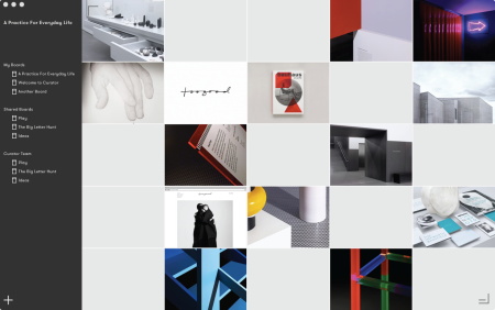
It’s been another busy week in the studio and we are closing in on the next major release. Here’s a quick update on what happened last week:
• The ‘Save to Curator’ Safari Extension is nearing public release after some great feedback. A big ‘Thank You’ to all our beta testers!
• We met with the founder of an international graphic design studio and learned about their internal workflow and how they present ideas to their clients. They shared valuable insights into their need for simple yet powerful tools.
• Prototyping a ‘Publish’ feature. This would allow Curator users to publish Boards to pages on the Curator website, but ultimately to your own website.
• Investigations into the feasibility of a Desktop version of Curator. We are exploring various workflow alternatives, use cases and technical hurdles to overcome. Will we be able to make Curator work on the Mac?
• Further content reworking and tweaking on the website.
Curator, this week

It’s been a busy week in the studio and we are hard at work on the next major release. Here’s a quick update on what we have been up to:
– A new version of the iOS app was released to our beta testers introducing; Sharing and collaboration, Bigger boards, individual Pinterest pin import as well as a number of bug fixes. Want to help us test?
Register to be part of the beta program.
– We also started beta testing our brand new ‘Save to Curator’ Safari Extension. Which makes it a snap to save websites and images to Curator from a computer.
– The blog has been updated with more creative resources, inspirational references and historic app release notes. There’s a lot to check out!
– A number of user interviews gave us some amazing insights into their respective workflows. We met with a design-focused PR agent, a world-renown tattoo-artist/art-director and an award winning international architect, quite a mix!
– This idea got us to improve our user research and support funnels in Trello.
Beta testing new features
Want to be the first to try new features?
Help us make Curator better by testing new versions ahead of public release on the App Store.
Sign-up on this page: http://curator.co/beta/!
Up next:
– Pinterest import
– PDF export
Introducing Curator for iPhone
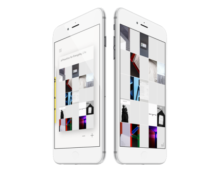
We are super excited to launch Curator for iPhone today!
It works great on all iPhones running iOS 8 but is simply incredible on the new iPhone 6 and 6 plus. We can’t wait to hear what you get up to with Curator in your pocket and look forward to be sharing more new features with you soon.
Backup & Sync
You can now backup and sync your content to all your devices by creating a Curator sync account. You can find the sign up in the app menu if you haven’t already created an account.
You might wonder why we are not using iCloud for sync. The reason is that we want you to be able to share and collaborate on your boards, which we would not have been able to do with iCloud. Backup and sync is free up to 1gb of data.
What we are up to
We are hard at work making Curator better and have a long to-do list of improvements on the go. Some things to look forward to in the near future include;
Re-ordering of boards – One of the most requested features is ready and in testing
Sharing and collaboration
– Having built the backup and sync functionality we will be able to roll out proper sharing of boards very soon
Share Extension
– Adding content from other apps in iOS will soon be super easy with the Curator share extension
Bookmarklet
– Adding content from your desktop browser is also coming shortly, because we know you don’t just work on your iPad or iPhone
We aim to release updates to Curator on a monthly basis, sometimes with minor releases in between addressing bugs. We are always grateful for reports of any issues you come across so that we can fix them.
We are looking forward to making Curator one of the greatest apps on your iPad, and now iPhone!
Build your own tools – why we are building Curator
Most of the time we just want to get on with our job. Whether you are a designer, developer, teacher, salesman or an architect, there is simply too much to do, and too many deadlines to meet to have the time to stop and think about how we do it.
A large part of being successful at work, regardless of profession, is to form, shape and communicate ideas clearly for other people to understand and support their realisation. Be it a sales pitch or a design review, the process is much the same, you have to collect, organise and present all sorts of content in a coherent way, and it doesn’t hurt if it looks good too.
While seated in front of a computer in an office we get these steps done by collecting content, more or less orderly, in folders ordered by name, date or size hailing from the very earliest days of the modern PC. Remember DOS anyone?
This might be followed by an attempt to select and structure this into an understandable narrative, perhaps in text or layout tool or even by sketching with pen and paper or printing it all out and sticking it on the wall to get an overview. Finally, once we’re satisfied the content is mostly there we export it as a file or open yet another tool like Powerpoint or Keynote to make it into a presentation. It kind of works, at least on a computer, and we all have our own unique workflows to make it work. The story is quite different out of the office though.
Few people that have picked up an iPad can escape the epiphany, going from ‘I really don’t need one’ to ‘wow, this is the future’ in an instant. It is such an amazing piece of hardware bringing the ease of use of mobile to a professional environment. You might have noticed, interestingly, that it’s perfectly acceptable even in business and bureaucratic environments to use an iPad during a meeting where opening a laptop or using a mobile phone would be out of the question. It really has the potential to be the modern equivalent to the classic Moleskine notebook, an essential tool in our daily work lives.
But being a young tool, not even five years old, its inevitable that it has not yet reached maturity and is unable to satisfy many of the requirements of a truly productive tool. Excitement of supposedly endless opportunities is often quickly accompanied by frustration. Frustration that all your digital content is suffering from severe fragmentation. Where we were previously used to collecting thoughts by project into folders we are now faced with them being scattered into different invisible locations; websites, images and text are all in separate apps by design, not to mention the cloud. This was a great way to get started on mobile, instinctively clear to beginners with a single-purpose, app-focused operating system. When you try to accomplish what we set out above though, building a narrative from different content types and presenting it visually, things quickly break down or take too long to be worth it. It doesn’t work. Or it didn’t used to work.
When we first had the idea of a visual grid where you would quickly add and reorganise different types of content together from the very first fragment of an idea through to presentation, it felt so obvious, so simple. It must already exist.
Sometimes the tools you wish you had are so far from the ones that actually exist, that you simply have to take some time off, a step back and reconsider. Now is the best time to rethink our tools for communicating succinctly, from idea to presentation. We just want it to work, as it should.
That’s why we are building Curator.
