Things that inspire us: the archives of Bernd and Hilla Becher

Bernd and Hilla Becher photo-archived the industrialisation during the mid 20th century.
Coal mine tipples, water tower, furnaces, industrial facade, grain silos and elevators, urban development and transport infrastructure around the factory site.
Their pictures collection display factories’ architecture across Germany. The exploration of the industrial landscape led both to explore and document Europe and the USA with a similar method.
Bernd and Hilla Becher assembled their series using typology and rigorous classifications. Their scientific approach is most visually shown through the view angle of each typologic series.
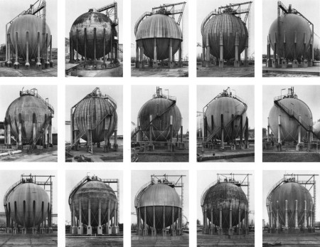
Single board presents a simple striking visual effect. It is almost the same building, repeated over and over, with some slight differences.
The grid is used as a graphic tool to assemble the pictures. The resulting visual clusters re-inforce the obvious similarities inbetween the buildings.
Why we like it:
• It’s fascinating to see the dedication and patience taking the pictures and organising them.
• Looking at the colossal tasks this represents, it is exciting to see how Curator could help a similar undertaking.
Things that inspire us: Charles Ross, Solar Burns
Charles Ross studied Mathematics at UC Berkeley in the 60s while discovering his passion for making art.
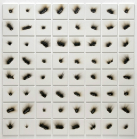
Ross sources sunlight and starlight to produce and inspire his artworks. Using prisms to beam light’s spectrum into architectural spaces, he also employs lenses to focus and converge burning rays on surfaces.
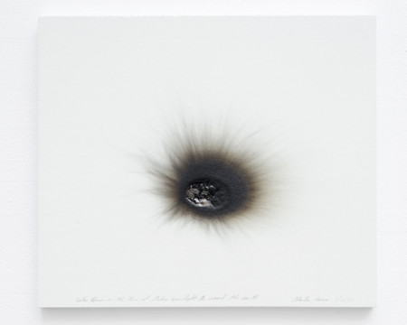
Solar Burn in the time it takes sunlight to reach the Earth 1/30/77
Why we like it:
• The process, like the medium is simple. The juxtaposition and repetition create an obsessive observation of the phenomenon.
• The grid is a tool that helps present content in a clear and meaningful way. By removing visual distinction, the grid helps the viewer focus. The essential differences and relationships created throughout the visual information become narration. The artist removes specifics of individual pieces and encourage the viewers to focus on the essential differences, and the repetition of the process.
• The Sun is 150 million km away from our planet Earth. Light travels at 300,000 km/s. It took 500 seconds, or 8 minutes and 33 seconds for the light to travel and come burn the paper.
• The sun is drawing a portrait of itself.
Charles Ross’s work was brought to our attention by one of the many amazing users of Curator, Jeronimo Rosales @JeronimoRosales
Things that inspire us: Orson Welles: F for Fake
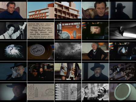
F for Fake is the last film by Orson Welles, released in 1974. It depicts and assembles the career of a forger. It explores the notion of truth, authorship, and value in Art generally and in the art market specifically.
The film is based on the personal stories of the art forger, his biographer, Orwell and his wife. The narrative extracts different perspectives on the story from those personal viewpoints.
Why we like it:
• Everything is true!
• It explores the boundaries of narration in cinema.
Critics usually describe it as a film essay because of the use of various genres in its core.
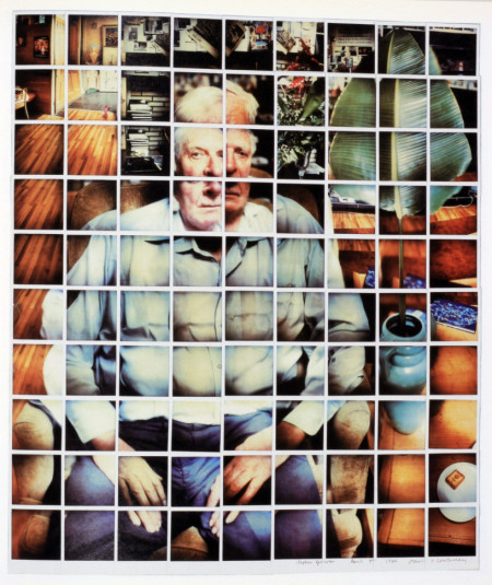
Things that inspire us: The polaroids of David Hockney
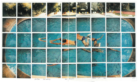
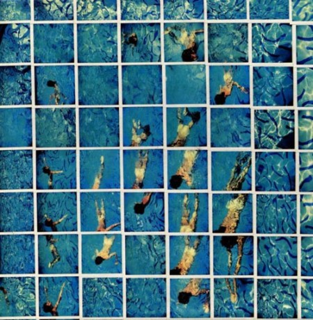
David Hockney started experimenting with polaroids in the early 80’s. This work followed a proposal from Paris’ Centre Pompidou for a photographic show. It developed as an exploration of cubism and the representation of three-dimensional objects in two dimensions.
With polaroids and 35mm prints, reassembled together, Hockney represents his subject.
The viewer has the impression of moving around the subject, an effect created by the juxtaposition of the photo-montage.
Why we like it:
• It’s a picture in a grid, we love grids!
• In his montage, Hockney observes his subject in the space over a certain time. There are close references to the creative process, in which we observe a visual concept or a set of ideas through different references. Their selection and arrangement help to further define the concept, both intellectually and visually.
Things that inspire us: Aby Warburg – Mnemosyne Atlas
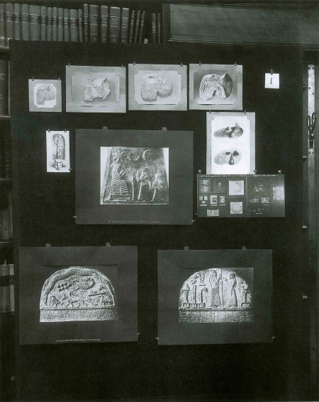
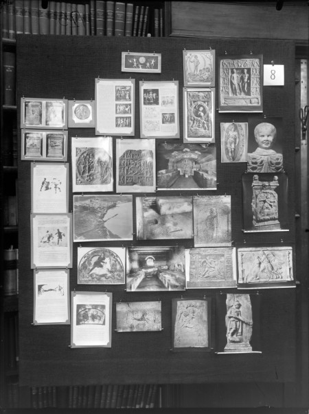
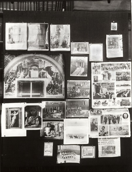
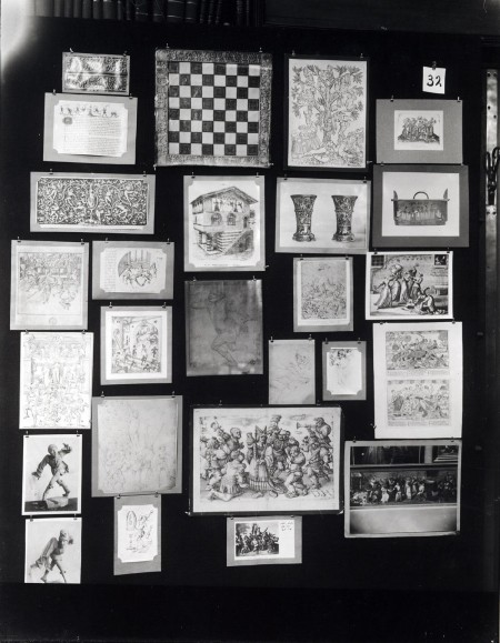
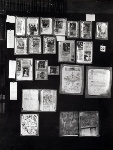
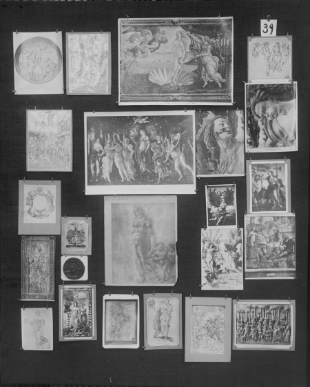
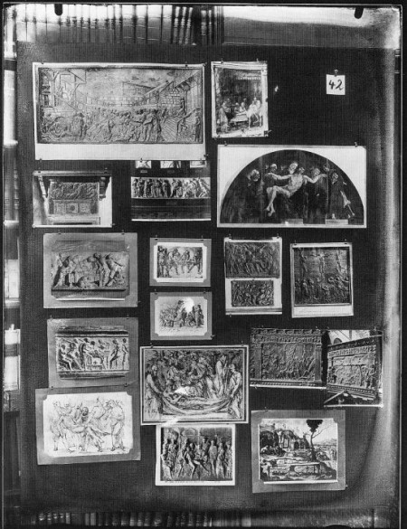
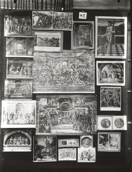
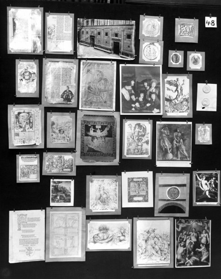
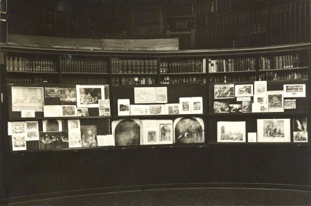
Art historian Aby Warburg’s Mnemosyne Atlas from 1927-29 is a picture atlas composed of black cloth covered panels presenting around a thousand pictures: mostly photographs, but also drawings, newspaper cuttings, reproductions from books and various materials from daily life.
The Mnemosyne Atlas interests lie in exploring the means of representation from classical to Renaissance period’s artists: how they used images to (re-)present the different themes Warburg explores. They are researching visual clusters based on connections Warburg made, points he wanted to illustrate.
Some examples of the themes explored include:
– Developments of the representation of Mars
– Ancient cosmology: astrological and geometrical images representing the cosmic system
– Ancient solar cults across continents
– the language of gesture
– the images of the nymph
Why we like it:
• Visual thinkers are everywhere—Aby Warburg was an art historian. His atlas is a constant reminder that visual thoughts can carry meaning and awake memories.
• The juxtaposition of ideas creates meaning. The curatorial practice of assembling mood boards was for Aby Warburg a story-telling tool to express concepts that would have taken many pages text to explain. An image is worth a thousand words.
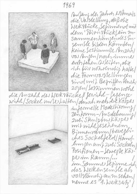
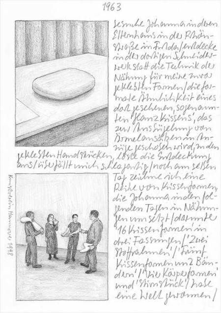
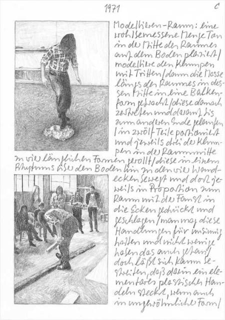
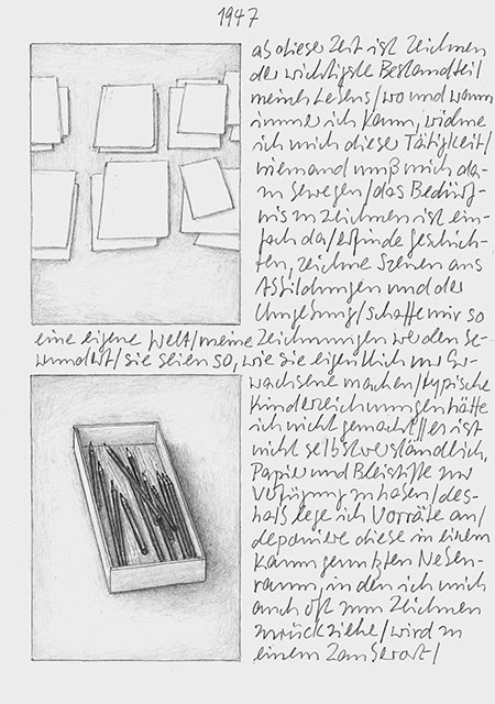
Things that inspire us: Franz Erhard Walther
Franz Erhard Walther produces sculptures, paintings and performances. His art is minimalist and conceptual. Since the 50s he has been questioning the idea of art made to hang on walls.
Why we like it:
• We like the idea of documenting art performances via drawings, creating another set of works in the process.
• Walter’s sculptures used in his performances always look like a massive playground!
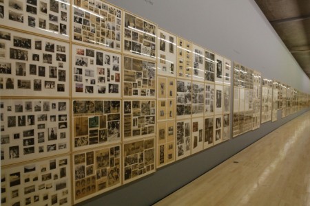
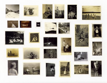
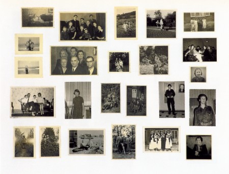
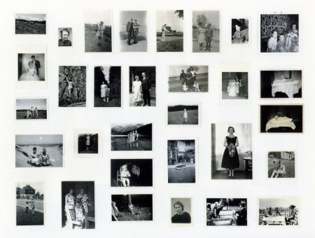
Things that inspire us: Gerhard Richter’s Atlas, 1962-2013
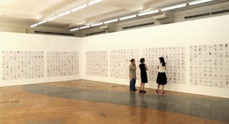
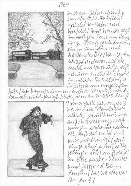
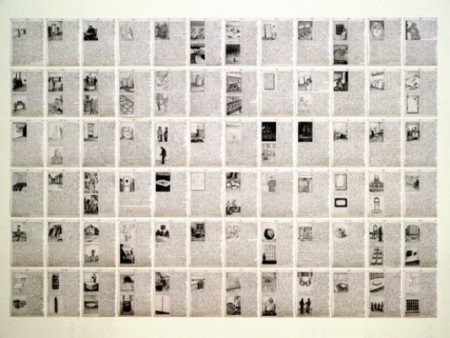
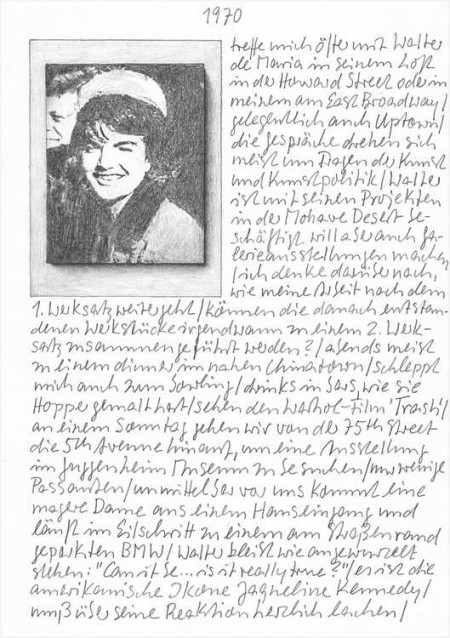
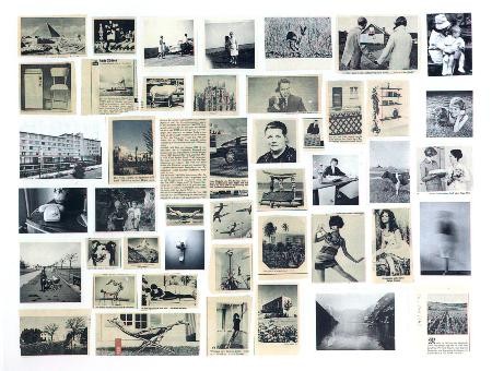
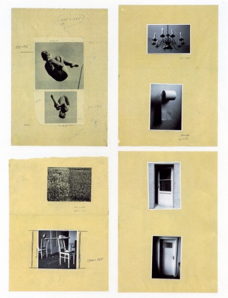
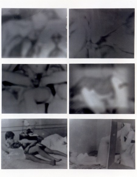
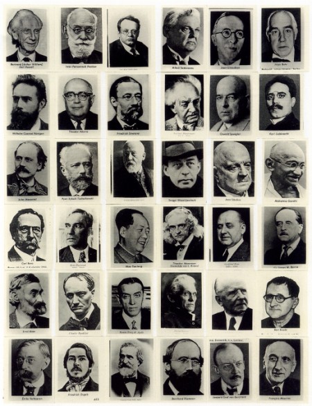
Gerhard Richter’s Atlas is a collection of photographs, newspaper cuttings, and sketches. Richter has been assembling them since the mid 1960s. He selects and arranges visual elements on loose sheets of paper.
Why we like it:
• The assembled pictures and notes give insights into Gerhard Richter’s thoughts process. It highlights the narratives he developed alongside his other works.
• The sheer amount of thoughts and visual references over the years is simply amazing.
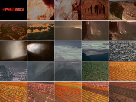
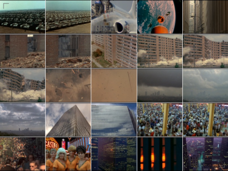
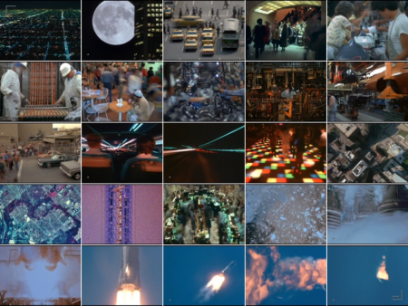
Things that inspire us: Koyaanisqatsi, The Life Out Of Balance
Koyaanisqatsi, The Life Out Of Balance
Directed by Godfrey Reggio, Music composed by Philip Glass
This classic film explores the relationship between Nature, Humans and our technology. How our sudden planetary development influences the world we live in.
Through its absence of narration, is not supposed to take sides: it simply shows facts.
The narrative is based on the juxtaposition in time of long sequence shots, slow-motion and time-lapse. The film uses simple means to build the storyline and there is no dialog, no actors, only the images and the music.
Why we like it:
• We appreciate the use of simple sequences, juxtaposed that help construct the narration
• The music! Philip Glass’ compositions are perfectly matching the editing and sequences.
• While assembling the images on Curator, we played the game of finding patterns in the sequences’ transitions.

Things that inspire us: The work of Sophie Calle
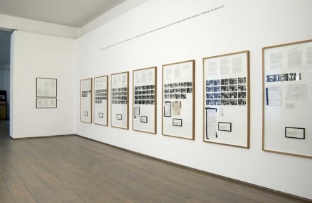
We have always been struck by the installation and presentation of Sophie Calle’s work. Beyond the artwork itself, the structure she deploys to tell a story is extremely enjoyable. It reveals the care for her audience’s personal engagement. Here is a very short introduction to a few of her pieces that inspire us the most:
Gotham Handbook – documents social interactions around a specific place in NYC.
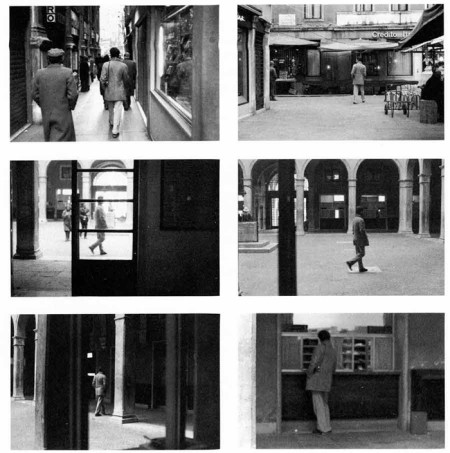
Suite Vénitienne – is the documentation of the artist following total strangers in the street. Calle is documenting and annotating her pictures with their actions and behaviours
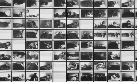
Sleepers – is a collection of pictures of people sleeping. Sophie Calle took one photograph per hour for 8 days of an invited guest, sleeping in her bed. Twenty-eight people succeeded one another for eight-hour documented sleep-shifts.
Why we like it:
• The sequence in Suite Vénitienne depicts her investigation into unsuspecting individuals. It works exactly like a storyboard.
• She mixes photography, text and written notes within the frame. She uses her experience, as an author would, to deploy a narrative.
• She works across media and combines text, images and annotations.
