Things that inspire us: the work of Dotty Attie
Dottie Attie is a NYC based artist. Her work is a social commentary using images from the art of the past.
Her appropriation work uses the grid as a mean of juxtaposition and works like a collage. There are some obvious relationships with comic strip narration. She uses text to drive the meaning further.
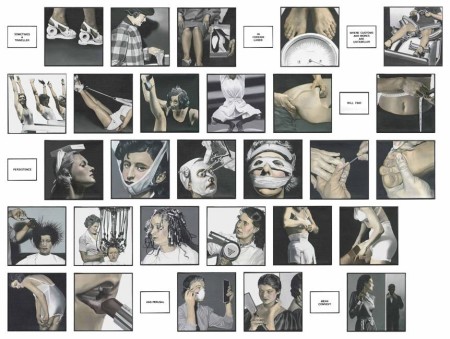
Skin Deep [text reads: Sometimes a traveler in foreign lands / Where customs and mores are unfamiliar / Will find / Persistance / And perusal / Mean consent.]
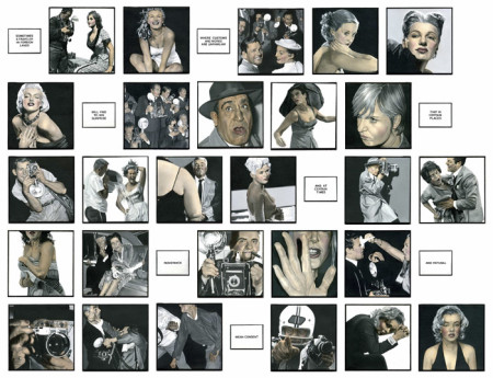
Snap Shot [text reads: Sometimes a traveler in foreign lands / Where customs and mores are unfamiliar / Will find to his surprise / That in certain places / And in certain times / Resistance / And refusal / Mean consent.]
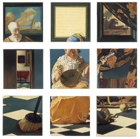
Vermeer’s Wife [text reads: When his estranged teacher Carl Fabritus died unexpectedly and under unusual circumstances, the news much delayed, reached Vermeer’s wife by letter.]
The Détournement process was initially developed by the Letterist and the Situationist art movements, later popularised by the Punk movement and 80’s culture jamming practices.
Why we like it:
• The question of the original and the copy surfaces trough the détournement nature of her work.
• The juxtaposition of apparently unrelated images, force the viewer to create his/her own narration; thus revealing more about our individual inner world than commenting on the external world.
• Could you re-use her re-used work and create a different meaning/narration?
* Dottie Attie’s work was brought to our attention by one of the many amazing users of Curator, Jeronimo Rosales @JeronimoRosales
Curator Journal
Curator Journal explores the creative processes of amazing artists and designers. How do they gather inspiration and references, how does visual thinking take place behind the scenes of the finished projects?
We make collaborative boards in Curator to interact with people behind the projects and the results are published in real time from the app.
The first issue of Curator Journal is a deep dive into some exhibitions and the designers’ Creative Process during London Design Festival at Brompton Design District.
A Tipsy Life
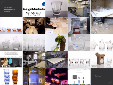
Back in October we invited Loris&Livia to our Creative Process talks at the V&A—along with other creative practitioners.They told the story of Tipsy glass, how they evolved the hunch of an idea into a product, marketed and sold worldwide.
Loris Jacquard mentioned on the night: “TIPSY started as a small local project at Bar Alto in London and is now sold worldwide. But what makes us really proud is that although we are now talking of mass production, we managed to stick to our original concept which was to make each glass truly unique.”

The original Picardie tumbler, made in France by Duralex.
Their presentation focused on how through countless experiments they managed to find their own unique production process and keep total control over it.
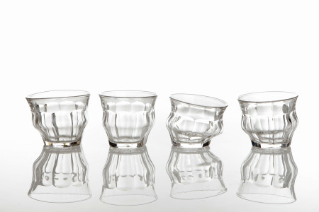
Tipsy, by Loris&Livia
Last week, Loris&Livia produced their 10,000th glass!
On this occasion Loris&Livia were interviewed by design magazine Disegno for their pre-Milan Design Week issue along with Viktor and Rolf, Jasper Morrison and Jonathan Olivares. The article goes into the Tipsy details and anecdotes; it is an inspiring read for anyone interested in small batch, designer-led production.
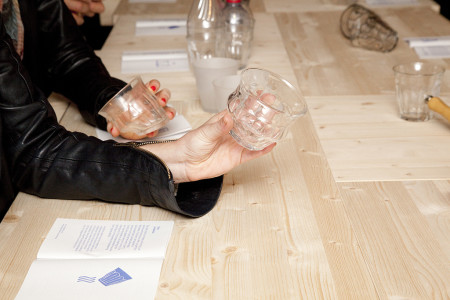
The original first edition of Tipsy, commissioned by Bar Alto
Interview and article in Disegno issue 8.
Loris&Livia website; you can buy Tipsy from here and here.
Story telling in Beirut
Last week, Jerome spent the week at the design university ALBA in Beirut with the 1st year Master in Interaction Design and Art Direction, working on narratives, mood board, story telling and photography. It was a direct hands-on exchange based on Curator and Jerome’s past experience in helping creatives and brands tell their story online…
The week long workshop was based on short intense sessions lasting 10 to 45 minutes. The aim was to introduce the students to techniques and methodologies, exploring their limits with an extreme emphasis on audience empathy.
Topics included:
– Brain-storming and brain-writing: How to kickstart the creative process, finding a topic and analyse it.Working on concise definitions of ideas—expressing visual concepts verbally
– Mood boarding: collecting images, classifying and organising according to various criteria (aesthetic, meaning)
– Picture research: how & where. Exploring the internet and the not so obvious places to find images that will help the creative process. Selecting sources and the right images to help convey the message. Exploring the offline: library, second hand bookshops, found pictures, etc.
– Brief-writing: including a series of sessions where the students had to write a brief for their picture researchers when directing a project (film, photography, branding/identity, etc.)
– Editing: building up a narrative, assembling a story from diverse images, selecting and refining choices
– Presenting: voice intonation, body language, context of the presentation
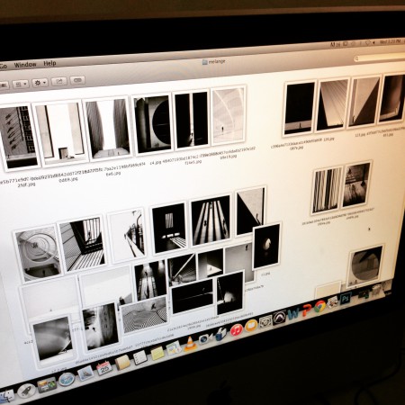
While Curator is enabling a modern, mobile way to collect, organise and present visual stories, the idea behind the workshop was a back-to-basics approach. We decided to have the students use the Mac’s Finder to organise and present their work. It was interesting to strictly limit the tools available to produce the presentations and gave us all a lot of insights on how to work better with simple tools. It also highlighted possible new directions for Curator to integrate the traditional workflow on desktop and laptop computers.
Big thanks to the Alba University for their invitation and their kind welcome—we had a great week working with interesting students with bright ideas a great dedication.
