Build your own tools – why we are building Curator
Most of the time we just want to get on with our job. Whether you are a designer, developer, teacher, salesman or an architect, there is simply too much to do, and too many deadlines to meet to have the time to stop and think about how we do it.
A large part of being successful at work, regardless of profession, is to form, shape and communicate ideas clearly for other people to understand and support their realisation. Be it a sales pitch or a design review, the process is much the same, you have to collect, organise and present all sorts of content in a coherent way, and it doesn’t hurt if it looks good too.
While seated in front of a computer in an office we get these steps done by collecting content, more or less orderly, in folders ordered by name, date or size hailing from the very earliest days of the modern PC. Remember DOS anyone?
This might be followed by an attempt to select and structure this into an understandable narrative, perhaps in text or layout tool or even by sketching with pen and paper or printing it all out and sticking it on the wall to get an overview. Finally, once we’re satisfied the content is mostly there we export it as a file or open yet another tool like Powerpoint or Keynote to make it into a presentation. It kind of works, at least on a computer, and we all have our own unique workflows to make it work. The story is quite different out of the office though.
Few people that have picked up an iPad can escape the epiphany, going from ‘I really don’t need one’ to ‘wow, this is the future’ in an instant. It is such an amazing piece of hardware bringing the ease of use of mobile to a professional environment. You might have noticed, interestingly, that it’s perfectly acceptable even in business and bureaucratic environments to use an iPad during a meeting where opening a laptop or using a mobile phone would be out of the question. It really has the potential to be the modern equivalent to the classic Moleskine notebook, an essential tool in our daily work lives.
But being a young tool, not even five years old, its inevitable that it has not yet reached maturity and is unable to satisfy many of the requirements of a truly productive tool. Excitement of supposedly endless opportunities is often quickly accompanied by frustration. Frustration that all your digital content is suffering from severe fragmentation. Where we were previously used to collecting thoughts by project into folders we are now faced with them being scattered into different invisible locations; websites, images and text are all in separate apps by design, not to mention the cloud. This was a great way to get started on mobile, instinctively clear to beginners with a single-purpose, app-focused operating system. When you try to accomplish what we set out above though, building a narrative from different content types and presenting it visually, things quickly break down or take too long to be worth it. It doesn’t work. Or it didn’t used to work.
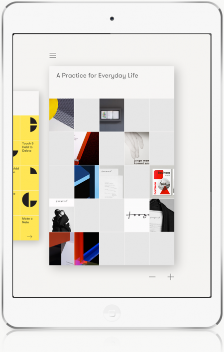
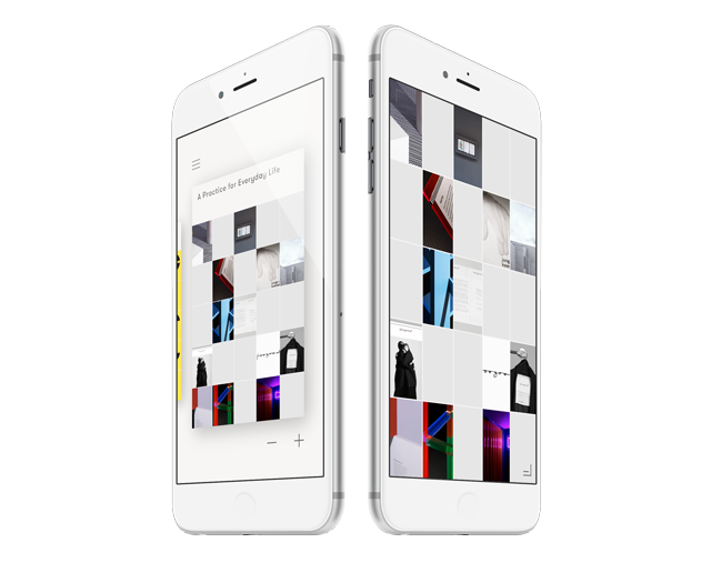
When we first had the idea of a visual grid where you would quickly add and reorganise different types of content together from the very first fragment of an idea through to presentation, it felt so obvious, so simple. It must already exist.
Sometimes the tools you wish you had are so far from the ones that actually exist, that you simply have to take some time off, a step back and reconsider. Now is the best time to rethink our tools for communicating succinctly, from idea to presentation. We just want it to work, as it should.
That’s why we are building Curator.


